
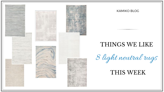
 It happens sometimes, when all of the elements in the room are placed together, the colors are great, the shapes are complimenting each other, but something seems to be missing. Upon a second look, it becomes apparent that more often than not, that happens in the rooms with bare floors, without rugs. Good rug can definitely help with grounding the room and defining a specific area. The latter is especially important in the open-concept spaces, where there isn't a natural separation between the "rooms". This season, we are sweet on light rugs, primarily off-white and some tones of blue. Below are a few of them that struck our fancy. Please note that this post contains affiliate links and we may earn a small commission from the purchases made through these links - all at no cost to you. MADRAS - MDS05 With its mix of off-whites, grays, and understated blues, this rug is a perfect addition to a casual interior. It adds richness without over-dressing the room. 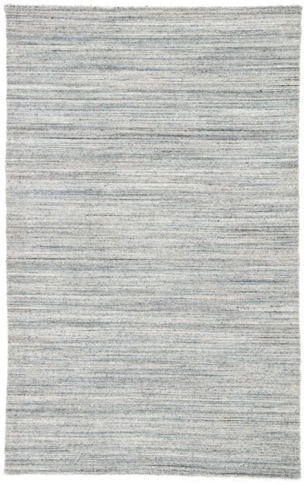 JULIETTE - JUT01 Do you want to play with texture but are afraid to make a bold first step? Try Juliette - with its light tone-on-tone color scheme, this neutral rug will help you ground any room, while not drawing too much attention to itself and allowing you experiment safely. 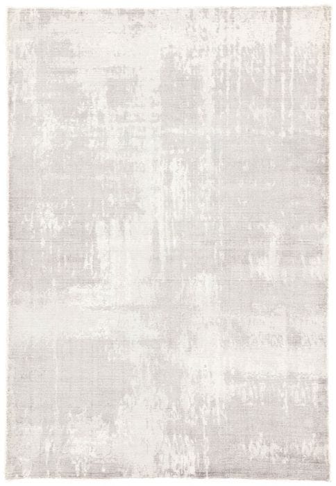 WREN - WRN02 Doesn't Wren just make you want to throw a couple of pillows on it and sprawl out with a book and a glass of... ahem, cup of tea or coffee? "Antique and luxurious, with a story to tell" is what comes to our minds when we look at it. And no worries that it will be brand new, it's the mood that matters. 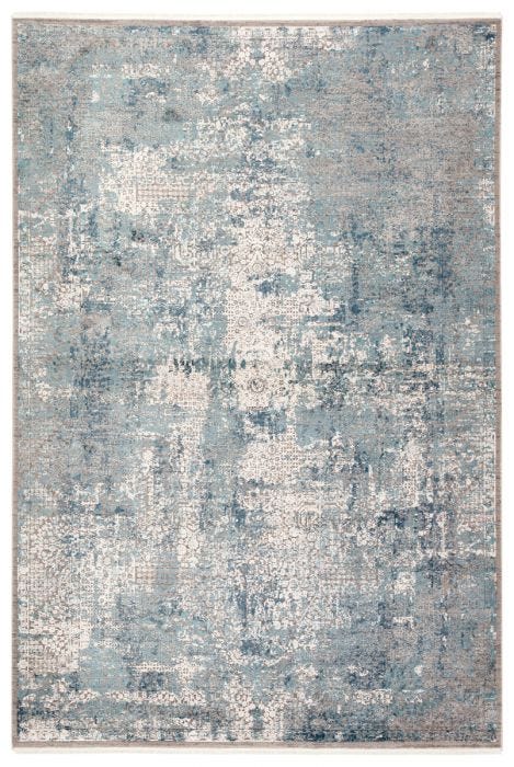 MADRAS - MDS04 Another Madras rug, this one is lighter and airier. Perfect for a sun room looking over a sandy beach or in front of a fireplace in the study full of books. 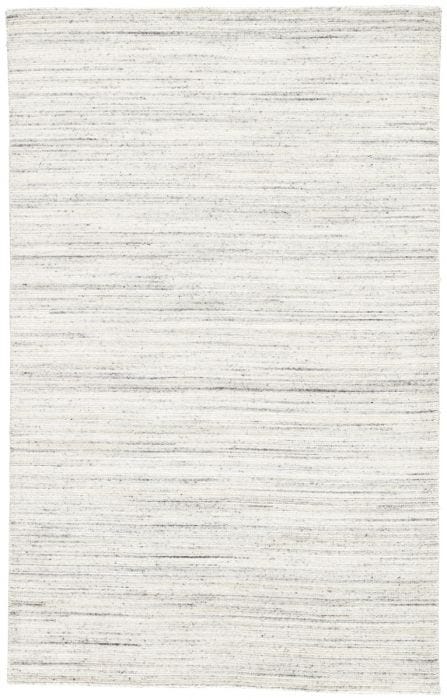 CIRQUE - CIQ08 One can't talk neutrals without mentioning some type of a beige color. Not being fans of the word "beige", we prefer to name this color tone "sand". It will go perfectly in a room with wood and upholstery in warmer tones, a nice break from all the grays we have been enjoying in the last few years. 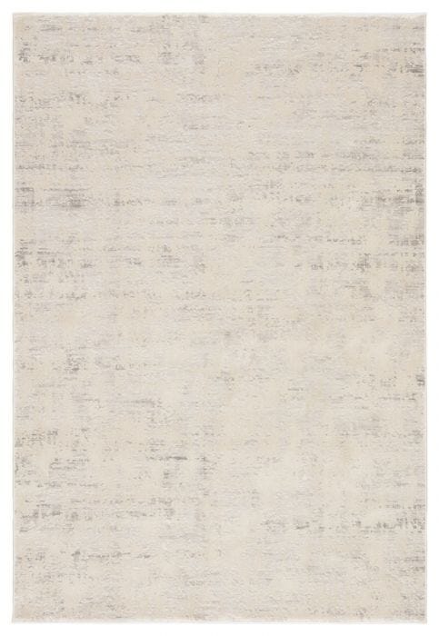 GENESIS - GES22 If you do not see a blue amethyst geode in this rug, then we don't even know what you are thinking. Just look at this magnificent pattern!. This is a stunner which should be paired with a glass coffee table, so not to obstruct all the wonderful swirls and loops curving into each other. 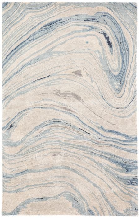 REBECCA - RBC03 When talking about light rugs, simple white always has a place in the conversation. Light, clean, simple, white pairs with almost anything. Although, probably, not with a rambunctious toddler running around with a cup full of grape juice... 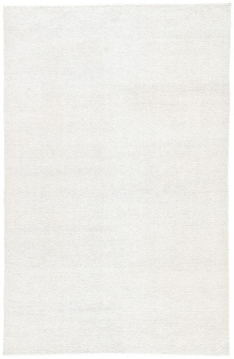 CIRQUE - CIQ30 This lovely number is not necessarily super light, but it has such an interesting color combination of off-whites, tans, and grays, all mostly muted, where it reads more like a texture than a color. Family room or a study could really benefit from having it on their floor. 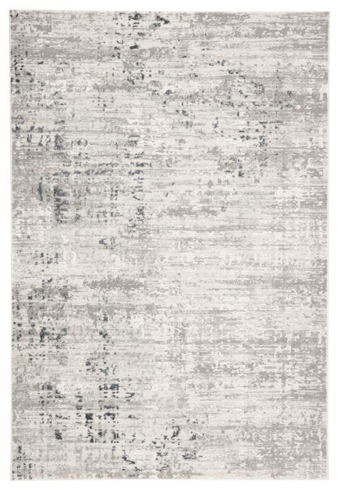
0 Comments
Your comment will be posted after it is approved.
Leave a Reply. |
about usSince KaMiKo Design Studio is a two woman shop, the same goes for our blog. Both of us, Mila and Katya, throw pearls of our acquired design wisdom in here. They often get combined with some fun life experiences, awesome things we go ga-ga over, and cool products we fall in love with along the way. Archives
August 2020
Categories
All
|
 RSS Feed